TimeHero Logo Design
One of the logo variants made for TimeHero, a time tracking and project management app. Flat monogram logo, the symbol is a “T” shaped hero mask.
One of the logo variants made for TimeHero, a time tracking and project management app. Flat monogram logo, the symbol is a “T” shaped hero mask.
**AVAILABLE FOR PURCHASE**Letter mark experiment. It gets harder and harder to create strong letter marks… Almost every shape exists already.Here’s a bold “E” symbol in the shape of a triangle. Suitable for companies with names starting with this letter, or as an abstract symbol.Contact us for details!
Symbol and Logo for French tech blog and online shop, featuring the number “2” in the middle made of electrical circuits. The clean and strong line art style symbol has a unique shape, and works very well alone too.
**AVAILABLE FOR PURCHASE**Creative brain logo design concept in flat style with subtle shadows. Suitable for companies offering creative services, coaching and all kind of problem solvers.Contact us for details!
There’s an inexhaustible source of inspiration for designers, and that is nothing but nature…Clean and minimal logo featuring an eagle in line art style, created for a software development company named Bald Peak.
The Furniture Box is a Wiltshire, UK based company, they’re specialized in great value modern furniture. When you place an order, you fill a box, that’s the image of the brand. The logo is literally a box, filled with furniture.
**AVAILABLE FOR PURCHASE**Creative Share Lettermark Logo concept in flat style with subtle shadows, featuring an “S” letter rotated 90 degrees for an even more abstract look. Suitable for companies offering IT services, file sharing solutions and apps, cloud file syncing services, collaboration tools, etc.Contact us for details!
Stylish & elegant letter mark logo for The Maverick Co. Real Estate Group. We tried to make the symbol unique as always, even though (almost) every house shaped design exist already… Luckily the initial of the company was a good starting point, and we arrived to this design at the end.
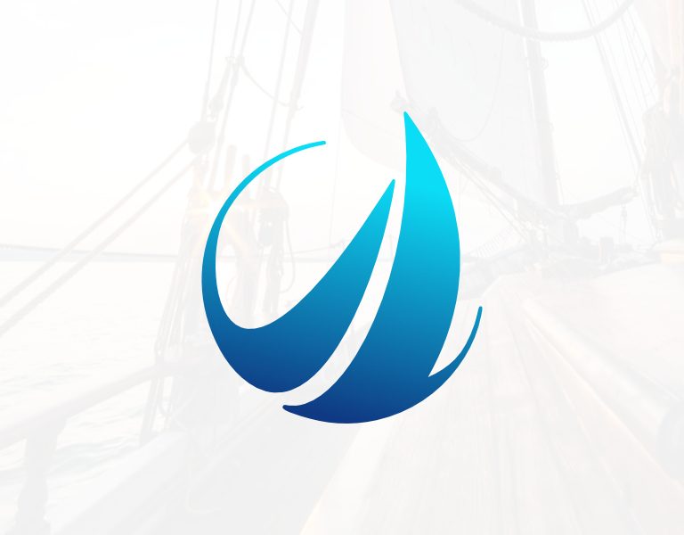
This was the final design for one of our most interesting projects. The client wanted a clean symbol that incorporates a sailing boat with waves and the letter O. Can you see them all?

Our website uses cookies to deliver the best possible user experience. We also use analytics to improve our content. Consenting to these technologies will allow us to process your data on this site. Not consenting or withdrawing consent, may adversely affect certain features and functions.
